Signal analysis
Three displays, all fed from the same live stream, all available while merely monitoring — so a player can be set up and a disc judged without writing anything to disk.
The three questions
The panels are stacked, top to bottom, in the order the questions come in. Between them they are the whole of setting a capture up, and a capture that turned out to be no good nearly always failed at a question nobody asked:
| The question | What answers it | |
|---|---|---|
| 1 | Do I have a signal? | Waveform — the live trace. Something is arriving, and it has the shape of RF rather than of a flat line, a hum or a burst of nothing between tracks |
| 2 | What is the signal? | Spectrum — what that something is made of. The video carrier, the analogue audio carriers, the EFM band: the components the disc in the player ought to have, at the frequencies they belong at |
| 3 | Can I capture it? | Amplitude History — the level, over the whole of the monitoring and the capture that follows. Not too quiet, not too loud, and holding there for as long as it has been watched |
Asking them in that order is what makes the answers mean anything.
The first has to come first because every other display draws whatever arrives. A spectrum of an unplugged input is a full screen of noise floor, laid out on the same axes, with a marker on the loudest bit of it — a picture that looks like a measurement and is an absence. The waveform is the panel that tells the two apart, because a flat line looks like a flat line.
The second has to come before the third because a level is only worth setting on the signal you meant to capture. An amplitude reading sitting neatly inside its bounds says nothing about what is sitting there: a player parked in stop, a tuner on the wrong input, or a video carrier with no audio under it will all give a perfectly well-adjusted-looking strip. Seeing the carriers you expect, where you expect them, is what turns "a signal" into "this disc's signal".
The third is the one that decides whether the file is usable, and it is the only one that cannot be answered from a glance. Too quiet and the disc's detail lives in the bottom few bits of the converter, with the noise floor of the front end scaled up to meet it in the decode; too loud and the peaks clip, and a clipped peak is gone rather than merely mismeasured. Between the two is a wide, comfortable middle, and the amplitude strip exists to show that the signal has stayed inside it — not at the instant you looked, but across the minutes since, which is the timescale a disc side actually takes.
Answer all three and there is nothing left to find out: press Start capture and the same three panels carry on answering them while the file is being written.
Statistics is the fourth question, asked of the machine rather than the signal — did it all arrive — and it is answered from every sample rather than from these snapshots.
How they are fed
The capture pipeline publishes a snapshot of the stream about nine times a second through a tap that never makes the pipeline wait for anything. A worker thread picks those up at about thirty times a second, does the arithmetic, and hands the results to the panels.
Two consequences worth knowing:
- Nothing here can slow a capture down. A display that cannot keep up misses snapshots; it never delays the stream. Frames are dropped rather than queued, because an old picture of a live signal is of no interest and a backlog of them would be worse than useless.
- These are snapshots, not the whole stream. The displays show a representative slice measured continuously, not every one of the 40 million samples a second. The Statistics panel is where whole-stream figures live — every sample is measured for the extremes, the clip counts and the sequence check.
Levels read in converter codes — 0 to 1023 — until a front-end gain is declared, and in millivolts at the BNC once one is. Declaring it, or correcting it, re-scales every figure already on screen: nothing was ever stored in the derived units.
At 20 Msps
Every figure on these three panels is a property of the stream, so all of them follow the Sample rate setting. Choose 20 MSPS for VHS and:
| Reading | At 40 Msps | At 20 Msps |
|---|---|---|
| Top of the frequency axis | 20 MHz | 10 MHz |
| Default span, in time | 200 µs | 400 µs |
| Default resolution | 9.8 kHz bins | 4.9 kHz bins |
| Encoder backlog | ms of signal | the same ms, from half the samples |
The numbers quoted throughout the rest of this page are the 40 Msps ones, because that is what a LaserDisc capture uses. Halve every frequency and double every time for the other.
Two things change in kind rather than in scale. The filter corner marker is not drawn at 20 Msps: it marks the board's analogue filter at 13.2 MHz, which is above the 10 MHz Nyquist and so has nothing on the axis to mark — the edge of the band there is the gateware's half-band filter, which sits at Nyquist itself and is the axis rather than a line on it. And the spectrogram clears when the rate changes, because a column of it spans DC to Nyquist: carried across, every carrier already on screen would move by a factor of two while still presenting itself as the same measurement.
The rate is fixed for as long as the device is open, so none of this can change under a running display.
What the gateware does to the signal on the way to 20 Msps — the 10 MHz filter, its response and its delay — is on The decimation filter.
Waveform
Do I have a signal?
The scope. The signal as it arrives, with time across and level up.
This is the first panel to look at and usually the quickest to finish with. A player that is running, on the right output, through a cable that is connected gives a band of RF that fills a recognisable part of the vertical scale and has television line structure in it at the default span. Anything else — a flat line, a trace that sits at one end of the scale, a mains-frequency wobble with nothing on top of it, a signal that comes and goes — is a problem with the bench rather than with the settings, and no amount of adjusting gain will fix it.
Answered here, the question does not have to be asked again: the other two panels are drawn from the same stream, so once there is something to look at, there is something for them to measure.
Trigger
Starts every sweep at the same point on the waveform — a rising crossing of mid-scale. On by default.
Snapshots arrive from the device at whatever point in the signal the USB transfer happened to begin, which bears no relation to the signal itself. Drawn from its first sample, an 8 MHz carrier is a different slice of a cycle every frame: the trace shimmers nine times a second and reads as a band of fuzz rather than as a waveform. Triggering is what every oscilloscope since the 1940s has done about this, and it is the difference between a trace you can read and one you cannot.
The crossing is located between samples, not at the nearest one. At five samples to a cycle, rounding to a sample would leave a fifth of a cycle of jitter — most of the shimmer the trigger is there to remove.
A dashed vertical line marks the trigger point, a tenth of the way across, so that what happened just before the edge is on screen too.
If nothing crosses the level — a flat input, or one that never comes back down far enough to re-arm — the display free-runs rather than freezing. A trace that has gone flat is exactly when you need to see it.
When that happens the plot says free running in its top-left corner and the trigger marker is not drawn. The box stays ticked, because the trigger is still on and still looking; what has changed is the picture, and that is where it is said. The distinction matters precisely because the two cases look identical for the signal that causes one: a flat input drawn free-running and the same input drawn triggered are the same flat line, and without the note you would be looking at an untriggered trace with a marker on it claiming otherwise.
Span
How much time is on screen: 0.5 µs, 1, 2, 5, 10, 50, 100, 200 µs (the default) or 500 µs. The choices are fixed counts of samples and the labels say what each one covers, so at 20 Msps the same ladder reads 1 µs to 1 ms — the counts are what must stay fixed, because the longest of them is bounded by the snapshot.
200 µs is about three television lines, and that is why the panel opens there. The first thing worth knowing is whether the player's RF output is set sensibly, and that is a property of the envelope rather than of the carrier inside it: at three lines the line structure is on screen, so a level that is too low, too high, or clipping on sync shows in the shape of what is drawn rather than only in the figures beside it.
The short end of the ladder answers a different question. An 8 MHz carrier has a period of 125 ns, so one cycle is five samples and 1 µs is about eight cycles — the classic few-cycles-on-screen a scope is set to, and the only range at which the shape of the carrier can be seen at all. It is at the bottom of the ladder when you want it. The ladder used to start at 10 µs, which is eighty cycles.
500 µs is 20,000 samples, the longest span that still shows all of the time it claims to. A span longer than the snapshot is silently clamped, and the time axis then labels what is actually on screen rather than what was asked for.
How the trace is drawn follows from the span, because one rule cannot serve a range that runs from thirty-three samples in a pixel to fifteen pixels between samples:
| Samples per pixel | Drawn as |
|---|---|
| 2 or more | the highest and lowest sample in each column, as a vertical bar |
| 1 to 2 | the sample points, joined |
| under 1 | the band-limited waveform the samples determine, with the samples marked |
That last row matters more than it sounds. At five samples a cycle, joining the sample points with straight lines draws a jagged pentagon whose peaks are up to 20% low — the samples mostly miss the crest. The signal is band-limited by the board's filter at 13.2 MHz, well under the 20 MHz Nyquist limit, so exactly one waveform passes through the samples; the display reconstructs it, as every digital oscilloscope does at these densities. The dots are the measured samples, so what was measured stays distinguishable from what was filled in between.
Persistence
How long each sweep lingers before fading, from off (the default) up to 2 seconds, in quarter-second steps. Off replaces the trace each time, which is the plain scope.
With the trigger on, every snapshot contributes up to thirty-two sweeps rather than one, taken from across the whole 819 µs the snapshot covers rather than clustered at its start. That is an effective sweep rate of around three hundred a second from a device that delivers nine snapshots a second — the samples were always there, they were simply being thrown away. The result is that the deviation of an FM carrier shows as a widening of the trace, tight at the trigger point and fanning out across the sweep, which is what an analogue scope's phosphor did and what a single sweep cannot show.
How long a tail is useful depends on what you are looking for, which is why this is a slider and not a switch. A short one — a quarter to half a second — keeps the display responsive and is already enough to see the deviation. A longer one builds a denser picture and is the setting for catching something that happens rarely, at the cost of the display being slower to show that the signal has changed. Two seconds is the top because past it that cost buys nothing: with the trigger on, a two-second tail has already accumulated something like five hundred sweeps.
The setting is a duration, not a per-frame fade: the figure is the time constant, so after it the picture is at 37% and after three times it there is nothing left to see. The fade is worked out from the time that has actually passed, so a tail is the length it says whatever rate the device happens to be delivering snapshots at — and a run that stalls for two seconds comes back having genuinely lost two seconds of picture.
The cursor
Point at the trace and the readout gives the position in microseconds and the level, in codes or in millivolts. The position is measured from the start of the sweep, matching the time axis below the plot.
Spectrum
What is the signal?
The same signal by frequency. Two views of it, chosen with the first control.
The waveform says that something is arriving; this panel says what. An RF signal off a disc is a sum of carriers, and on the spectrum they are individually visible and individually identifiable — the video carrier, the analogue audio carriers below it, the EFM band lower still on a digital-audio disc. Each is at a frequency the format fixes, so what is on screen can be checked against what the disc in the player is supposed to produce.
That check is what the panel is really for. A missing analogue audio carrier, a video carrier several hundred kilohertz from where it belongs, a spike that has nothing to do with the disc sitting on top of the band — each of those is invisible on a waveform, which sums everything into one trace, and each of them changes what the capture is worth. The spectrogram extends the same question over time, for the things that are only wrong sometimes.
Only once this is answered is it worth setting a level, because a level is set on whatever happens to be arriving and the strip cannot tell you what that was.
Spectrum
A live trace: level against frequency, 0 dBFS being a full-scale sine wave. That reference is the one you can act on — a carrier at −6 dBFS is using half the converter's range, and the number says so without anybody having to know how the transform was normalised. Every level this panel states carries the unit, on the scale and in the readouts alike, because decibels without the other half of the ratio are not a level.
Each snapshot the pipeline publishes is 32,768 samples — 819 µs of signal — and all of it is measured. The snapshot is cut into half-overlapping segments, each one is windowed and transformed, and their powers are averaged: fifteen of them at the default resolution. A single transform is a noisy estimate whose scatter does not shrink however long you make it, so this is what makes the noise floor sit still rather than boil, and a floor that sits still is what lets a weak carrier be seen against it.
There are far more bins than pixels, so each column of the display draws the highest bin it covers rather than the first or the average: a narrow carrier that fell between two sampled bins would otherwise simply not be drawn, which on a display whose job is finding carriers is the one failure that matters.
The strongest peak is marked, with its frequency and level, without your having to point at anything. A ring sits on the highest point of the live trace and the label beside it reads the same way the cursor does. This is the reading somebody adjusting a player actually wants — what is the carrier doing — and it is the one an analyser gives you without being asked. If nothing on the trace rises above the bottom of the scale, nothing is marked: a marker sitting on the floor of an empty display would be pointing at the absence of a signal and calling it the strongest one.
Spectrogram
The same measurement over time: frequency up the side, time running left to right over a fixed window labelled in seconds, level as colour.
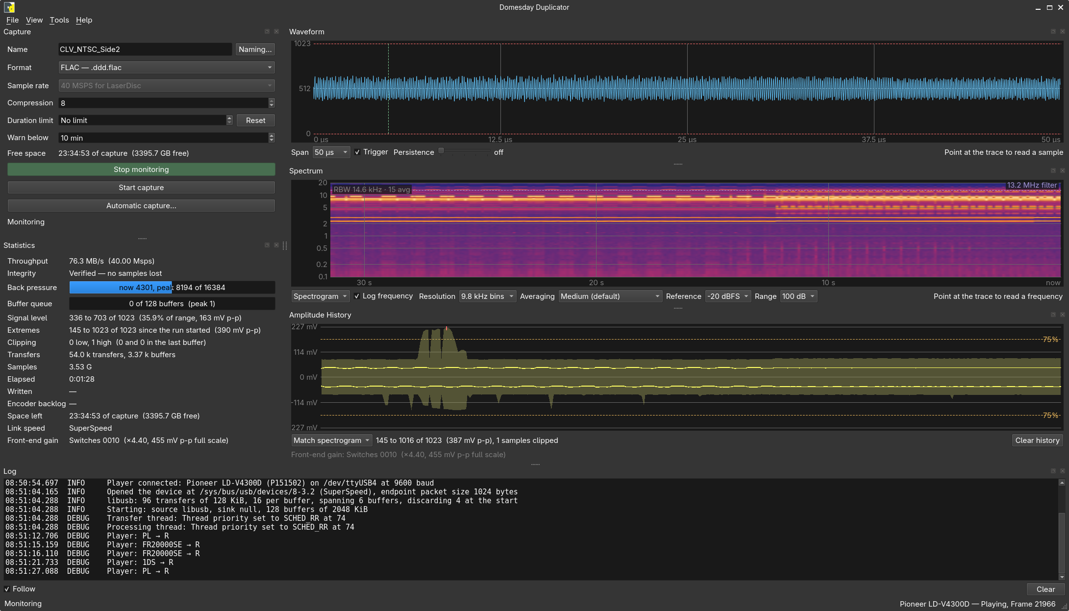
This is what makes a drifting carrier or an intermittent interferer visible at all — neither is distinguishable from ordinary noise on a live trace, because by the time you have looked away and back the trace has moved on.
The spectrogram records whichever view is showing, so switching to it shows what has already happened rather than starting again from the moment you asked for it.
Its rows are not affected by the Averaging control. A row is a moment — one snapshot's own measurement — and averaging belongs to the trace alone. At the heavy setting the trace's filter reaches back most of a second, which is a third of the width of a minute-long waterfall; a transient smoothed by that would be smeared across several rows of the one display whose entire purpose is saying when something happened.
RBW
In the top-left corner of the plot, in both views: RBW 14.6 kHz · 15 avg. The resolution bandwidth the measurement was made at, and how many segments were averaged for it.
An analyser is never without this figure, because every level on the screen depends on it. A noise floor is spread across the whole spectrum, so a narrower bandwidth collects less of it and the floor reads lower — the same signal measured at half the bandwidth shows a floor 3 dB down, with no change to the signal at all. A level with no bandwidth beside it is not a measurement, and two levels taken at different Resolution settings are not comparable.
Note it is not the same number the Resolution control gives. That control names the bin spacing — 9.8 kHz at the default — and the Hann window in use collects from half again wider than a bin, so the real bandwidth is 14.6 kHz. The control names the spacing because the spacing is what the choice is about; the corner names the bandwidth because the bandwidth is what the levels depend on.
The avg figure is how many half-overlapping segments went into this measurement, and it follows from the Resolution: fifteen at the default, seven in the middle, three at the narrowest. It is a statement about how steady the reading is rather than about what it says.
The filter corner
A dashed violet line at 13.2 MHz in both views, labelled. Not drawn at 20 Msps, where it would be above Nyquist — see At 20 Msps.
That is where the board's anti-aliasing filter turns over. Everything above it is the filter's skirt and the noise underneath it, not the signal — the roll-off you can see there is the hardware doing what it is for. It is marked because it is the one feature of either picture that belongs to the instrument rather than to the disc, and a reader who does not know that is looking at a spectrum falling away above 13 MHz and wondering what is wrong with the player.
On the spectrum it is a vertical line; on the spectrogram, where frequency runs up the side, it is a horizontal one. Both are at the same frequency on the same axis, whichever spacing is in use.
Log frequency
Spaces the frequency axis by decade rather than evenly. On by default, and it applies to the spectrum and the spectrogram together — they are two pictures of the same measurement, and a panel that placed the same carrier differently in each would be worse than either alone.
The content here runs from the EFM band at 200 kHz to the filter corner at 13.2 MHz, which is nearly two decades. Spread evenly, everything below 2 MHz is crushed into the left-hand seventh of the display while the octave of very little between 10 and 20 MHz gets more room than the whole digital audio band. The PAL analogue audio carriers at 683.6 and 1066.4 kHz end up under 3% of the width apart — a few pixels, reading as one feature. Spread by decade they are a tenth of the display apart, and the EFM band, the audio carriers and the video carrier are each a legible region.
Turn it off to read the filter's roll-off or the symmetry of the FM sidebands. Both of those are about equal spacing in hertz, which is what an even axis shows and a decade one does not.
The axis starts at 100 kHz when logarithmic. Below that there are fewer than ten bins in total at the default resolution — an expanse of axis with almost no measurement behind it, and on a decade scale it would be the widest part of the display. An even axis starts at DC, where there is nothing wrong with drawing zero.
Both scales run to 20 MHz — everything the stream can represent, and 10 MHz when decimating — and there is no control to change that. There used to be one, offering tops from 14 to 20 MHz, because on an even axis the stretch above the anti-aliasing filter's corner at 13.2 MHz was a third of the width spent on the part of the spectrum the hardware has deliberately removed. On a decade axis that same stretch is a fifth of a decade — under a tenth of the width — so the display just shows all of it, the filter's roll-off is always there to look at, and there is one fewer thing to set.
Switching between the two spacings throws nothing away and interpolates nothing: both are the same measurement re-laid-out.
Resolution
How finely the spectrum is divided: 9.8 kHz bins (the default), 4.9 kHz or 2.4 kHz, being transforms of 4,096, 8,192 and 16,384 points at 40 Msps. The bins are a fraction of the rate, so the same three transforms buy twice the resolution at 20 Msps and the list says so.
This is a trade, and both halves of it are real. Narrower bins separate carriers that sit close together — the analogue audio carriers below 3 MHz are the case that wants them. But a snapshot is a fixed 32,768 samples, so a longer transform means fewer segments to average across: fifteen at the default, seven in the middle, three at the narrowest. The default resolves the FM carrier and its sidebands comfortably while keeping the steadiest floor.
A bin is not quite the same thing as the resolution: the Hann window collects from rather wider than one bin's spacing, so the default's real resolution bandwidth is about 14.6 kHz. That is the figure the corner of the plot states, and the one to quote when comparing levels — see RBW above.
Averaging
How much of the previous display each new transform replaces: None, Light, Medium (the default) or Heavy.
This is averaging between snapshots and is separate from the segment averaging above, which happens within each one.
More averaging makes a weak carrier readable against the noise. Less shows a transient that would otherwise be averaged away. The averaging is done on power rather than on decibels, so a peak that appears in one frame out of ten reads as a tenth of its power and not as a tenth of its level.
Reference and Range
The spectrogram's colour scale, offered in the spectrogram view only. Reference is the level the top of the scale stands for — 0, −10, −20 or −30 dBFS — and Range is how far below it the scale reaches: 100, 60, 40 or 20 dB.
The defaults, 0 dBFS over 100 dB, are the whole of what the converter can represent and assume nothing about the signal. They are often not what you want to look at. The difference between a healthy noise floor and a marginal one is a few decibels, and spread across a hundred that is two shades of the same colour; narrowing the range spreads the same colour ramp over fewer decibels and the texture appears.
Everything already on screen is re-coloured when you move either control, including rows recorded before you touched it. The history is kept as levels rather than as a picture precisely so that this works.
Peak hold
Draws the highest level each frequency has reached since the last reset, underneath the live trace. The way to catch an interferer that appears for a moment while you are looking somewhere else. Reset peaks starts it again.
Off by default. The live trace is what a signal is set up against, and a second trace over it is a distraction until there is a reason for it — an interferer you suspect but have not seen is that reason. Switching it on starts the peaks from that moment rather than revealing what has been accumulating unwatched since monitoring began, so what it shows was measured while you were looking for it.
Both belong to the live trace, and each view shows only the controls that do something in it: peak hold and its reset in the spectrum, the two colour-scale controls in the spectrogram.
The cursor
Point at the plot for a frequency and level. Over the spectrogram it also gives how long ago that column was measured, so a feature can be located in time as well as in frequency.
The level it reports is the one drawn in the column under the pointer, computed by the same code that drew it — so the readout and the picture cannot disagree, on either axis spacing. Pointing at the marked peak gives the same words the marker beside it does, for the same reason: it is the same reading, not a second one.
Amplitude History
Can I capture it?
A strip of the last five minutes: the min/max envelope, RMS drawn either side of 0 V, and a tick wherever clipping happened. Ten points a second, aggregated from the statistics stream.
The last question, and the one that decides whether the file will be any good. There is a band the signal wants to sit in — high enough that the disc's detail is well clear of the converter's own noise, low enough that the peaks never reach the rails — and this strip is where you see whether it is in it. Too cold and the decode is working with a fraction of the converter's range; too hot and the peaks clip, which is not a small error but a piece of the waveform replaced with a straight line. The nominal bounds drawn across the strip are the edges of that band: sit inside them, with the clip count at zero.
What makes this a strip rather than a number is the over time part. A level is easy enough to set on the moment you happen to be looking at, and a disc side lasts half an hour or more. The history shows the whole of what has happened since monitoring began — so the answer to can I capture it is not "it looked right when I checked" but "it has stayed right for as long as I have been watching", which is what the question was really asking.
This is also the panel that catches the faults the other two cannot. A player whose RF output sags for two seconds forty minutes into a side is invisible on a scope you are not looking at and invisible on a spectrum that has averaged it away; here it is a notch in the envelope, still on screen when you come back.
The history belongs to a run. Starting a run clears it, because the strip is a record of one continuous stretch of signal and splicing two runs together would put a discontinuity in it that looked like a fault. Stopping a run leaves it on screen — that is the evidence of what just happened, at exactly the moment somebody wants to look at it.
The first points appear about a tenth of a second in. On the default All span the strip is drawn across its full width from the second point onwards, so it goes from empty to a full-width trace almost at once rather than creeping in from one side.
The nominal bounds
The strip marks the recommended level on both sides: the signal should peak at no more than 75 % of the converter's range, which is codes 128 and 896.
It is a nominal level rather than a limit. The hard limit is the converter, which clips at 0 and 1023 and is counted separately; the headroom between the two is what absorbs the moments a disc is worse than the moment the gain was set on. A capture that spends its time at 95 % is not yet clipping and is one dropout away from it.
The bound is drawn on both sides because the signal is centred and swings both ways — a bound on one side alone would say nothing about the half of the waveform that was already closer to the rail.
Span
All shows everything the history holds — five minutes, once it has filled.
Match spectrogram narrows it to the same span the Spectrum panel is showing, so the two scroll at the same pace and a moment on one lines up with the same moment on the other. It is the setting to use when you are trying to work out whether a level dip and a spectral event are the same event.
Matching means the strip fills in from the right-hand edge over the spectrogram's whole window — around half a minute — exactly as the waterfall beside it does. That is the point of the setting, and it is why a freshly started run shows very little on this span for the first several seconds. Switch to All to see a short run spread across the full width.
The summary
Under the plot: the range across everything still held, and the clip count.
Note that this is not the same as the whole-run extremes in Statistics. These figures fall off the back as the five minutes wrap, and that is the point — they answer how is it doing now, not what is the worst it has ever been.
Clear history
Starts the history again from now, without affecting the run. This is for after a cable or a gain setting has been changed, when what came before is no longer what is being measured.